Why a website looks different on different screens? (and what to do with that)
Desktop monitors, laptops, netbooks, tablets, smartphones and even TV’s. There are so many devices and every one of them comes in many versions with different display sizes. And with mobile devices there’s also orientation (vertical/horizontal) to consider.
What’s more, there’s after all no obligation to use the web browser in a maximized window. In this way we get an unimaginable number of window sizes in which a website can be opened.

Photo by: Robert Couse-Baker
Web browsers
What makes it more difficult are the differences in how web standards are implemented by browser producers. There are quite a number of them but currently only 5 brands matter that have together dominated 90% of the market: Firefox, Chrome, Internet Explorer, Opera and Safari.
Fortunately, version by version the differences get smaller and those observed between the latest browser versions are not a great problem for web developers, which doesn’t mean they can be ignored.
Still, we won’t get into detail here, assuming that a webmaster or agency simply has to handle this.
Resolutions
As technology develops, the popularity of specific screen resolutions (size in pixels) changes. 1024×768 reigned supreme for long, but in early 2012 it ceded the throne to 1366×768 that has since stayed in power enjoying quite a big advantage over the second place.
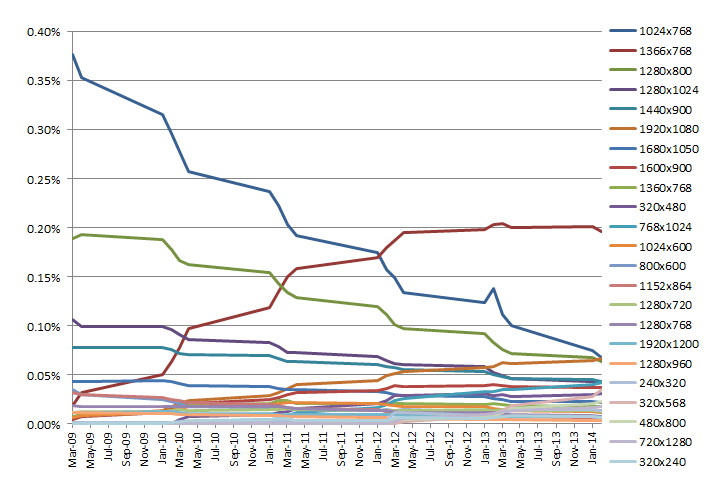
Top screen resolutions 2009-2014. Source: StatCounter Global Stats
However, when building fixed width websites (see “Designing” below) you don’t take into account the most popular resolution but the lowest resolution that is commonly used.
Up till the end of 2007 this was 800×600 pixels and the websites built at the time were approximately 750px in width. When viewed on modern screens being 1300 pixels wide or more such websites look funny as they leave huge margins on both sides of the page.
1024×768 took over as the minimum resolution in 2008 and the fixed width sites “grew” to about 960 pixels.
The “lifetime” of the 1024×768 resolution was extended by netbooks and tablets and its share still remains above 5%. Part of WWW creators still try to “fit” in 960 pixels and some already decided to ignore such screens and target at about 1200px.
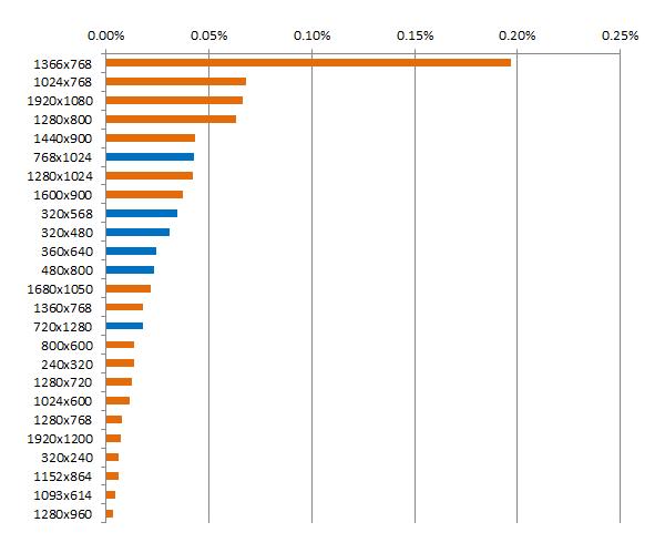
25 top screen resolutions in February 2014. Source: StatCounter Global Stats
Mobile screens
Mobile devices category (tablets and smartphones) sees a technological race to cram countless pixels into the smallest possible space. This is how you get five-inch screens with Full HD resolution (1080x1920px), i.e. greater than the resolution of numerous monitors of “adult” computers.
Fortunately, such great density of pixels is used mainly in video and photography, whereas websites are displayed “magnified” – they are automatically resized to the width defined in their codes (viewport). In this way a mobile site created with 320px width in mind will be appropriately “expanded” and will look good on a screen that is 1080 pixels wide.
Designing
How to build a website to look good in every resolution?
And I’d like to add that “good” in no way means “the same”.
There are four main designing approaches when laying out elements on a website:
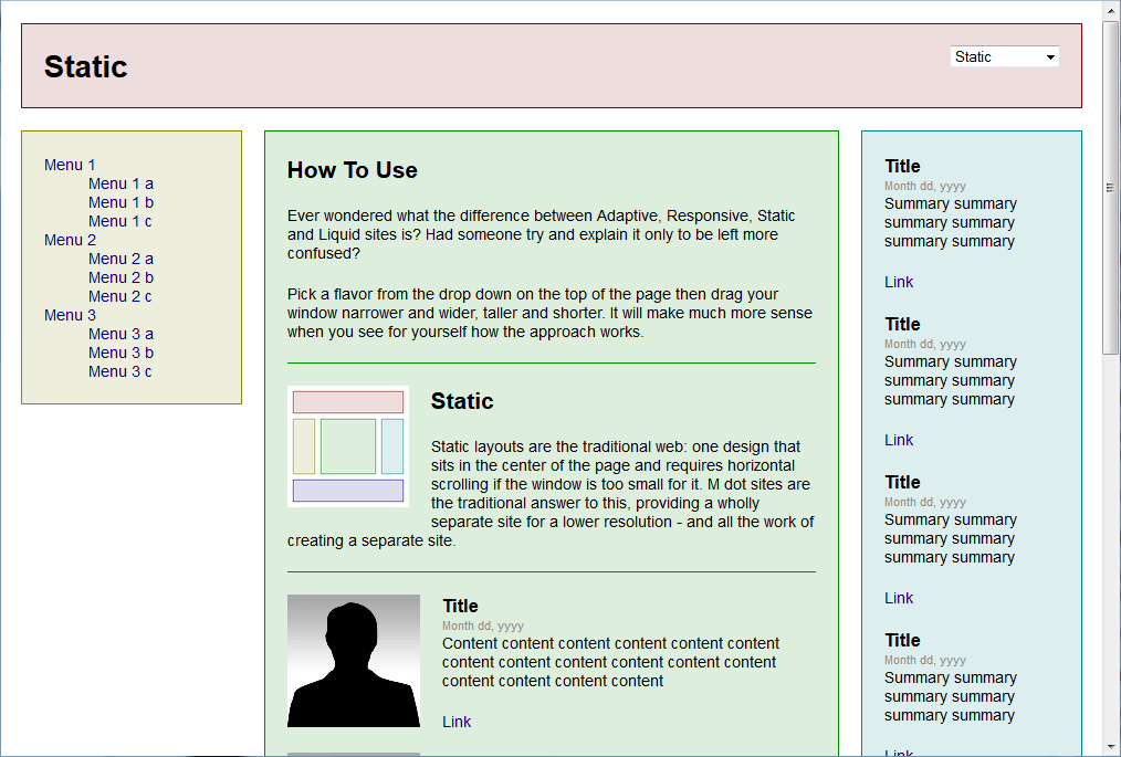
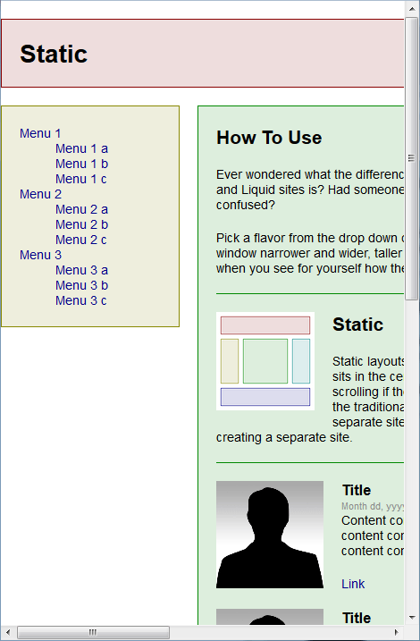
Fixed-width layout
This is the one mentioned above, being the simplest and most popular, where the width of a website is fixed regardless of the size of the browser window.
The designer is certain that the website doesn’t change. With resolutions higher than the original the website looks good but it doesn’t optimally use the whole space available – the wider the window, the larger the margins on the sides.
It’s worse with resolutions lower than the original – the site just doesn’t fit the screen.
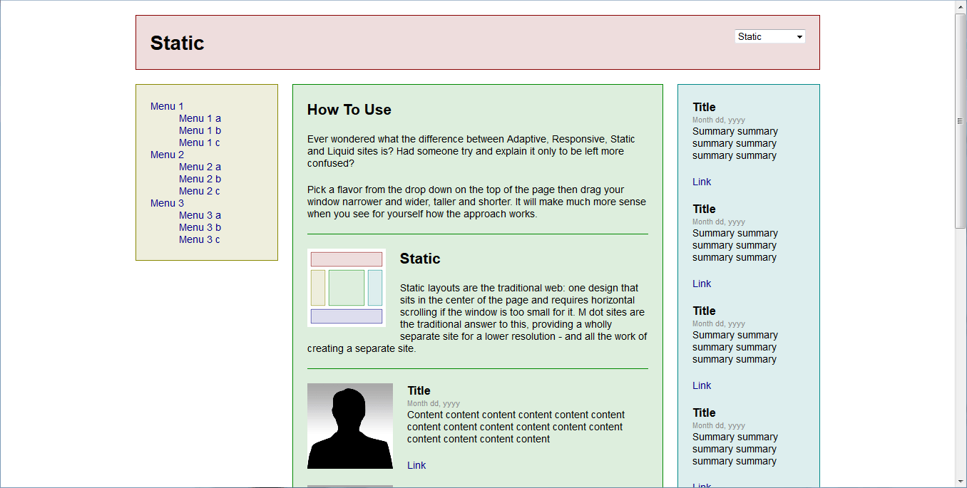
fixed-width layout, 1366×768
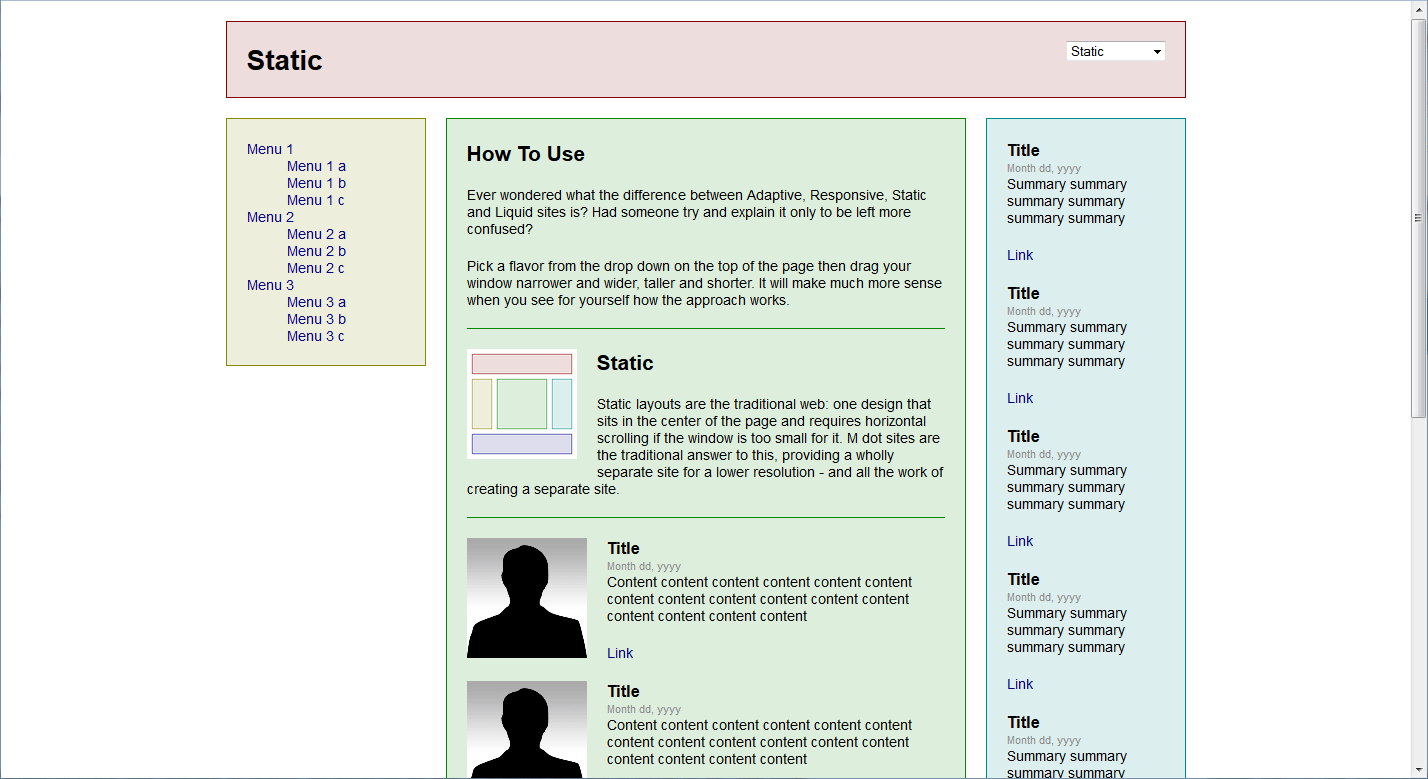
fixed-width layout, 1440×900
fixed-width layout, 1024×768
480×800
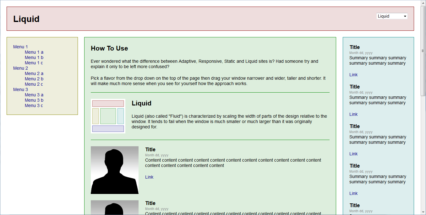
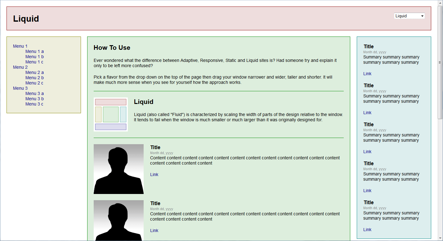
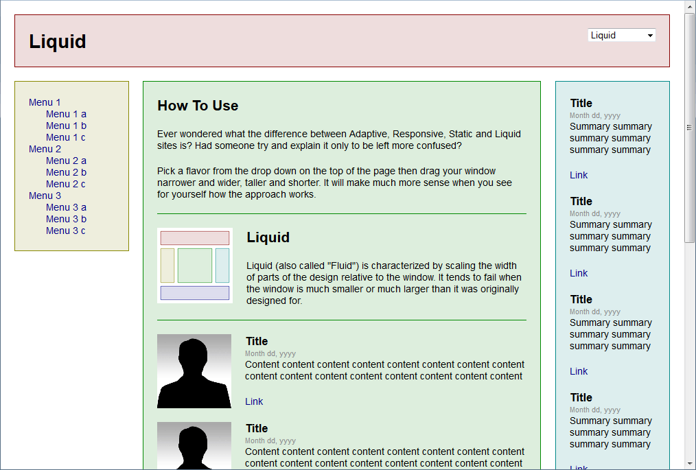
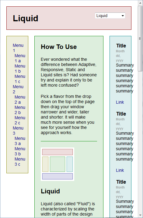
Liquid layout
The widths of elements are not specified in pixels but in percentages and the site “stretches” across the whole screen. It is a very simple (not “intelligent”) way to fit to the window size and so the final effects can vary greatly.
This is a good layout for projects poor in graphics, such as Internet forums.
liquid layout, 1366×768
liquid layout, 1440×900
liquid layout, 1024×768
480×800
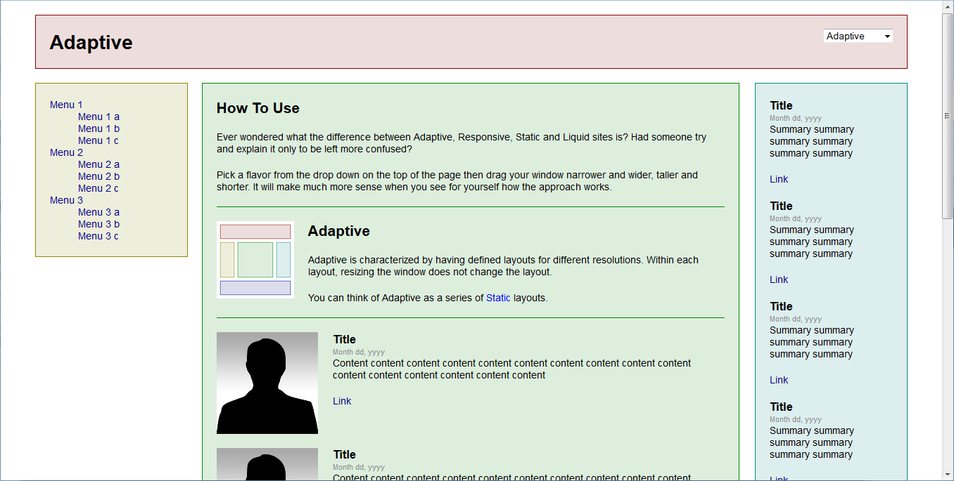
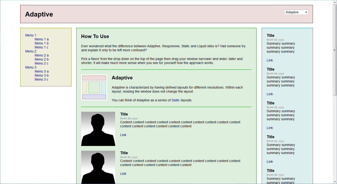
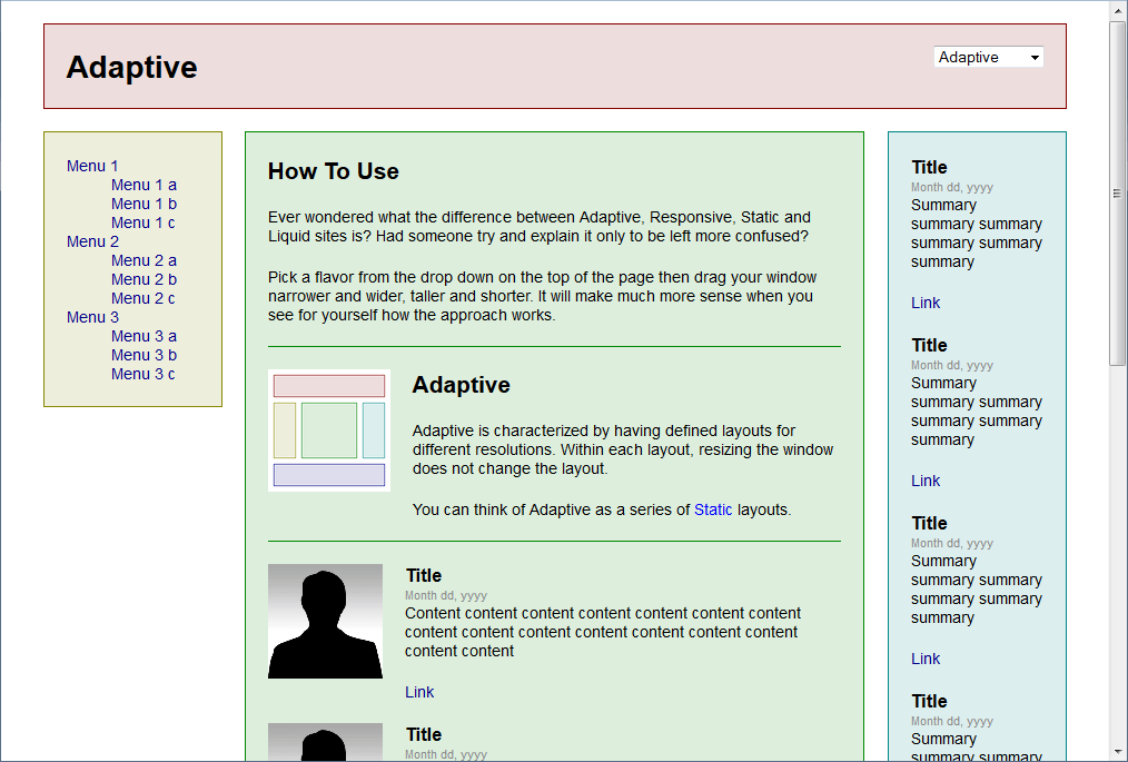
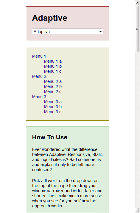
Adaptive layout
This is actually a set of several (for example five) separate layouts prepared for different resolutions. Depending on the window width a different template is loaded – defined for a specific width range.
adaptive layout, 1366×768
adaptive layout, 1440×900
adaptive layout, 1024×768
480×800
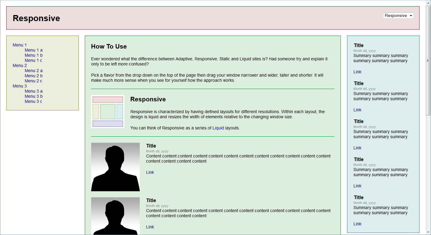
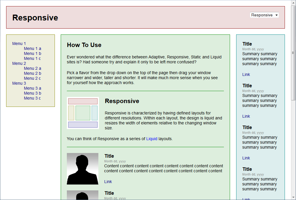
Responsive layout
Responsive Web Design (RWD) is a more advanced technique that gives the best results and is recommended even by Google. It is a combination of adaptive and liquid layouts and made up of several separate layouts, every one of which is liquid within a specific width range.
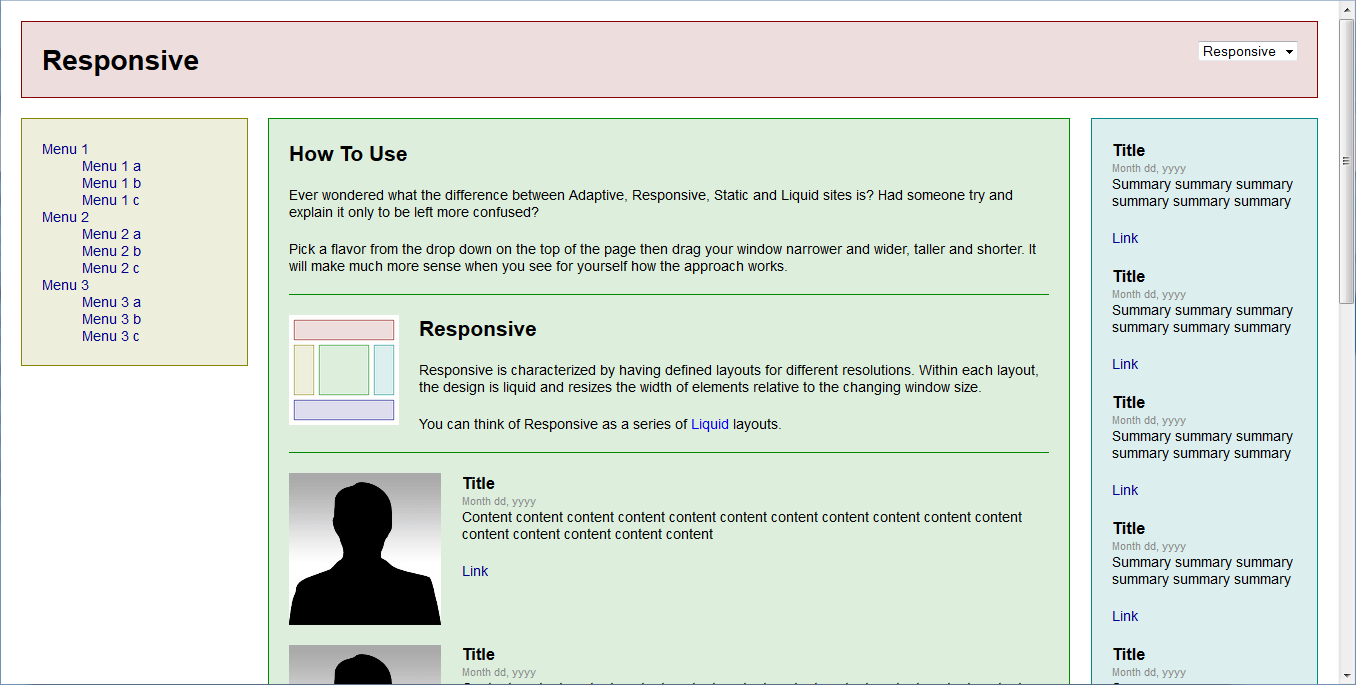
responsive layout, 1366×768
responsive layout, 1440×900
responsive layout, 1024×768
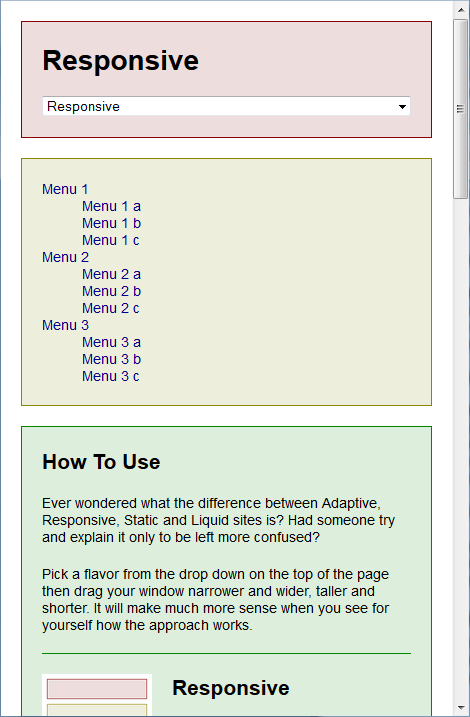
480×800
The above illustrations of different layouts in different resolutions come from liquidapsive.com where the differences between the layouts can be seen “live”.
Practice
In practice, the following three solutions are most often used:
- fixed-width layout, which means mobile users are completely ignored;
- adaptive layout, made up of 2 to 4 sets of templates:
- for computers,
- for smartphones,
- for tablets in portrait orientation (not always),
- for tablets in landscape orientation (rarely, because in this case they often provide you with the version for computers);
- responsive layout.
Testing
The easiest way to test how your website behaves in different resolutions is to open it on a computer with a monitor of a relatively high resolution and then to gradually decrease the width of the browser window.
Unfortunately, it’s not always possible to check in this way what a site looks like on mobile devices – the adaptive layout (and sometimes the responsive layout, too) provides appropriate templates often not only using the information about the window width but also about the browser (mobile device detection).
Hardly anyone has many types of devices with different display sizes at their disposal – what can help here are specialized applications such as Browserstack.
Decisions
Despite appearances, it’s not difficult to choose a solution (layout) – it depends on your starting position.
First of all, forget about the fixed-width layout. Mobile devices now generate more than 10% of the entire web traffic and this number is growing rapidly. Nobody can afford to ignore the mobile.
A pure liquid layout (one set of templates) can be used with websites that are entirely textual, like applications, administration panels etc. But even there it won’t be ideal as the navigation that is comfortable to use on a computer will rarely work on a mobile device.
I would recommend the adaptive layout (i.e. different templates for different width ranges) in two situations:
- If the form on your website is as important as (or more important than) the content – creation contains a lot of graphics and the location of each element in relation to other elements is of key importance. Then you just have to have a full control over every layout and every pixel.
- Your website doesn’t support mobile devices now but the version for computers is fine and you don’t want to change it. Then you may simply add mobile versions as alternative set of templates.
In all other situations, when building a website anew, don’t hesitate and take the responsive way. It’ll take some time and money to implement it but the effect will repay you with nice appearance and the ease of use on every device.
Comments (3)
Why a website looks different on different scre... 03-07-2014 wrote:
[…] Desktop monitors, laptops, netbooks, tablets, smartphones and even TV's. There are so many devices and every one of them comes in many versions with different […]
Ramin 10-08-2020 wrote:
Hi.
How can I make a website that does not change its content and format in smaller screens?
I mean exactly the same contents should be displayed on both mobile and bigger screens. In mobile screen, the contents are shown smaller and the user has to zoom in to read it properly.
What I am working on is a fixed-width layout.
Thank you in advance.
Brandon Line 25-08-2020 wrote:
Hi Ramin.
I believe that your website does need to change on smaller screens. Currently it doesn’t, so you need to zoom in.
Your website interface needs to be modified to work properly with all screen sizes, especially mobile.
Some time ago it was quite popular to add an alternative layout and set of templates for mobile. Now most website use RWD (Responsive Web Design) that makes everything fluently align on any screen.