Keep ignoring mobile and you’ll lose your ranking in Google
The time has come that you really MUST adapt your website to mobile devices. I explain why and suggest how to do it best.

Photo by: Hernán Piñera
‘Fix mobile usability issues found on …’
Such alerts have recently been received by those users of Google Webmaster Tools, whose websites are not adapted to mobile. If you don’t use GWT and your website is found not adapted it is bound to be ranked down in Google search results without any warning.
Yes, there’s no mistake here ‒ on 21 April 2015 Google starts to take ‘mobile usability’ of websites into account while assessing and ranking them in search results.
That is why website owners from all over the world have got down to the mobile versions of their websites that were neglected or didn’t exist at all.
But my clients don’t use smartphones
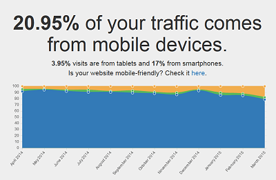
If you don’t track your website statistics regularly this may be quite a surprise for you. Share of mobile traffic (i.e. visits coming from smartphones and tablets) is constantly on the rise and globally has already exceeded 30% (or even 50% if we include non-browser traffic, i.e. generated by mobile applications).
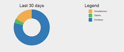
If you have the Google Analytics tracking code installed on your website you can quickly (two clicks) check the volume of mobile traffic using this simple tool: Mobile Ratio.
My website’s just great
No doubt about that – but maybe it looks good and works well only on the computer screen? Check whether Google considers your website ‘mobile-friendly’: Mobile friendly test.
Websites that are designed for large horizontal screens and mouse/touchpad navigation can never be viewed comfortably on small vertical touch screens. They are displayed scaled down (reduced in size) and in order to read anything you need to zoom by ‘pinching’ and pan the page in many directions. Active elements (menu, links or buttons) are too small for fingers and it’s an ordeal to complete a form. Moreover, the whole website is too large in size as for mobile communications links, where you pay for every megabyte, and loads too slowly.


Mobile version or responsive website
You can adapt an existing website to mobile devices in two ways.
The first is to create alternative templates that will be used when a mobile device is detected. In this solution two sets ‒ smartphone templates and separate tablet templates – are most often added to desktop templates.
The second way ‒ which is preferred by Google and is better in the majority of cases but still not always ‒ is to prepare one set of new templates in RWD (Responsive Web Design) technology. Responsive templates dynamically adjust to the screen width – some elements scale (e.g. modules), other change (e.g. a horizontal menu is replaced with a vertical dropdown menu) or disappear completely because they’re useless on small screens.
You’ll learn more about template layouts reading one of our previous articles: “Why a website looks different on different screens (and what to do with that)”.
Implementation
It’s best to have your website integrated with new templates by its builder or by the agency that cares for it. You can also have the templates made by the same company but only if the company is competent at designing for mobile. Otherwise the templates may be designed and made by a specialized agency that will provide you with a package of files ready for integration.
Ask us about adapting your website to mobile devices.
Mobile applications
One step further towards mobile users is launching an application for mobile devices. With the majority of websites, which serve the purpose of sales and marketing, this doesn’t make much sense because nobody will install additional software only to view the content of the website. Yet in the case of more advanced systems that people use regularly this can make it much easier to access key functionalities.
Furthermore, launching a mobile application costs much more than modifying a website because you have to prepare at least three versions of an application – one for each leading mobile operating systems (Android, iOS and Windows Phone).
Automatic generators and creators
“Mobile version of your site in 3 clicks” sounds as tempting as “Create your website on your own” ‒ and offers similar quality. Websites that automatically generate a mobile copy of your site may prove themselves only rarely. They will work well if the website is very simple and its owner doesn’t care about the individual appearance of the mobile version (being consistent with the desktop version).
There are also creators that enable you to ‘click yourself’ a mobile site from scratch. But have you ‘clicked yourself’ the desktop version of your website using a creator? That’s the point.
Mobile first
Share of mobile devices in the internet traffic is growing so rapidly that it’s becoming more popular to design especially for mobile. That means smartphone and tablet screens are treated as the most important and computer screens as secondary.
Recap
The necessity to adapt your website to mobile devices has for long been not only a matter of ‘if’ or even ‘when’. Now the question is ‘will I manage to protect myself against going down in Google’ and ‘do I lead or fall behind in my business field’?
Any further delay will cause an increase in bounce rate on your website ‒ more and more mobile users will quickly leave your site for your competitors’ pages which probably are already adapted to portable devices.